The CSS version, and why it looks like that
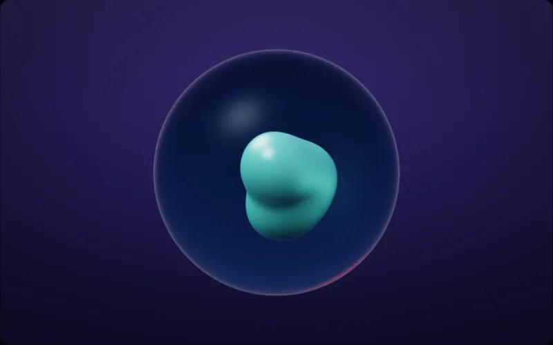
The usual blob animation css is a div with a lopsided border-radius and a keyframe animation walking it through three or four sets of values. It is a good trick: a dozen lines, no dependencies, and it runs on the compositor. Its limits are the ones any keyframe has. The cycle is as long as you wrote it, so the eye finds the loop; the shape is one closed curve, so two blobs cannot melt into each other; and the fill is a gradient, so it bands on a wide screen.
What a shader computes instead
A shader has no keyframes to loop. The blob is a distance field sampled at every pixel, driven by time, so the shape is never in the same place twice and two wells can merge and part on their own. Because the field is evaluated per pixel, the edge is exact at any size — no interpolation between states, and a touch of grain from the post chain keeps a wide fill from banding.
When to keep the CSS
If a single soft shape drifting behind a card is the whole requirement, the CSS is the right answer and this page is not. A shader earns its place when the blob is fullscreen, when it has to react to the pointer, or when it needs to be several things at once — ink in water, a metal pool, a glass bubble. Those are in the catalogue.